Norton Family Foundation
Brand Identity
Live site
Overview
The Norton Family Foundation focuses on hands-on education and regenerative agriculture, with a mission centered around children, community, and access to healthy food. This rebrand was an opportunity to create something that felt less institutional and more alive, reflecting the energy of learning, exploration, and growth. As Lead Brand Designer, I developed a visual system that balances structure with play. The identity draws from organic forms, bold color, and expressive elements to create a brand that feels both grounded and engaging, designed to scale across digital, print, and community touchpoints.
CLIENT
Norton Family Foundation
Type
Brand Identity
year
2023-2024
Brand Activation
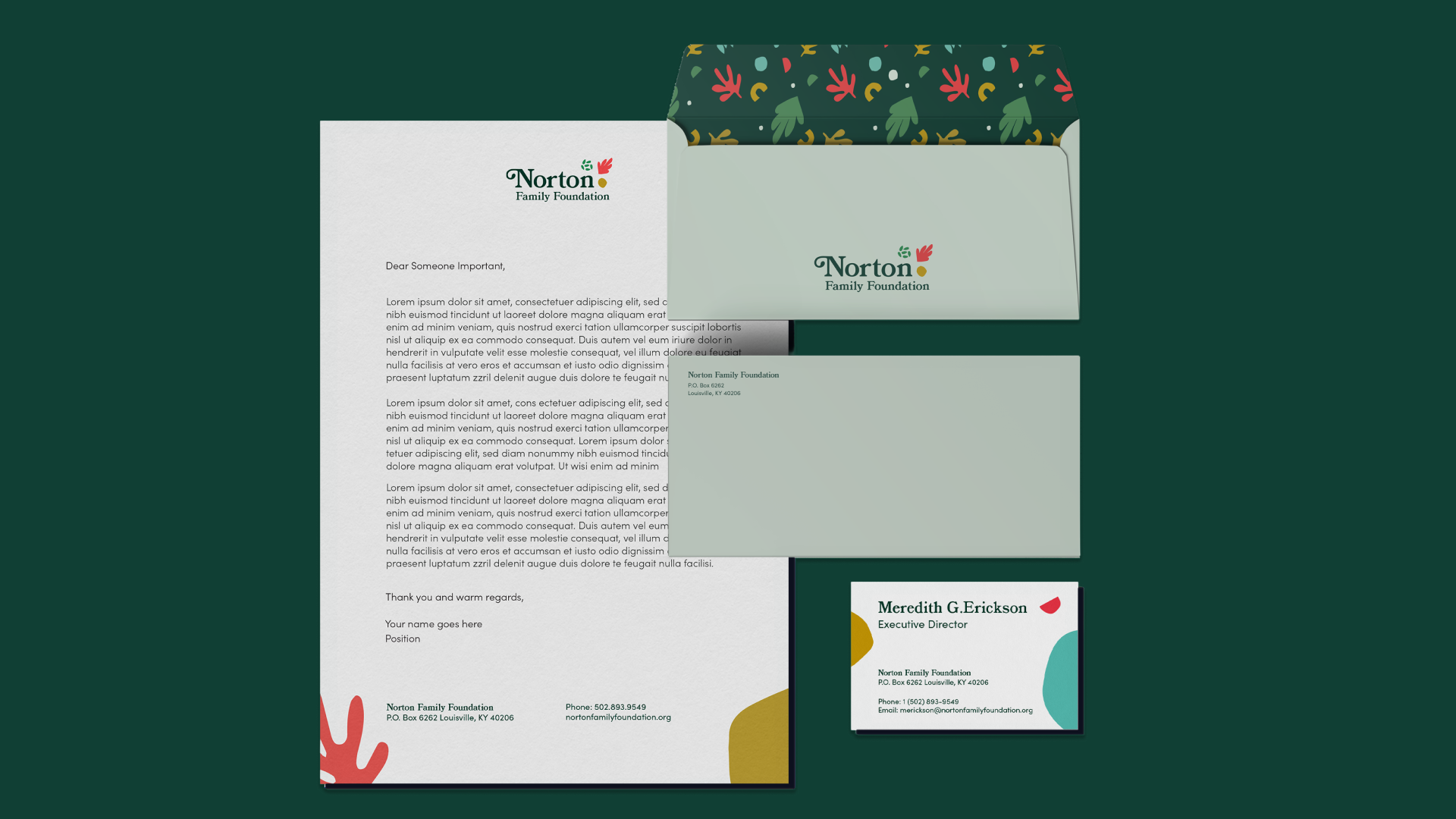
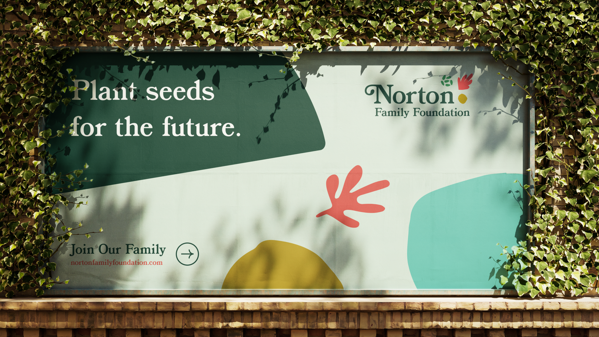
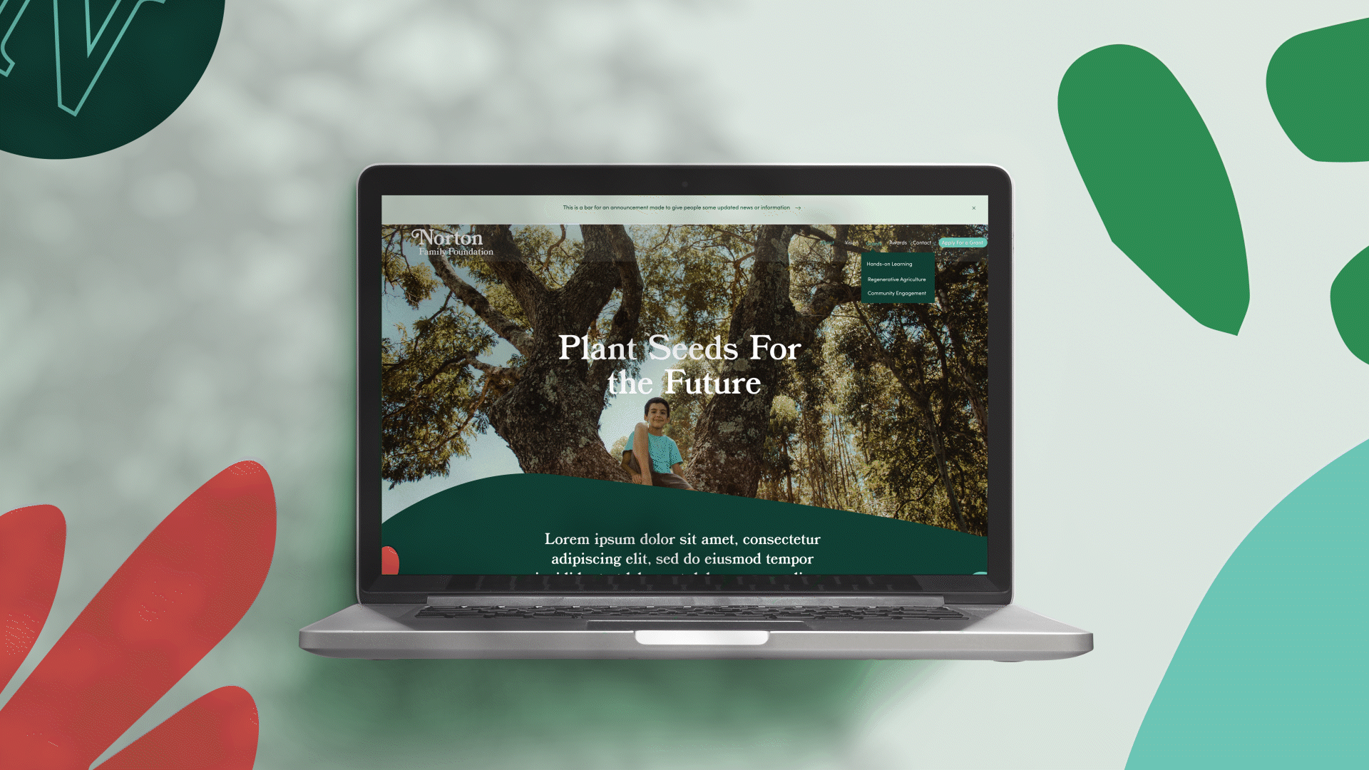
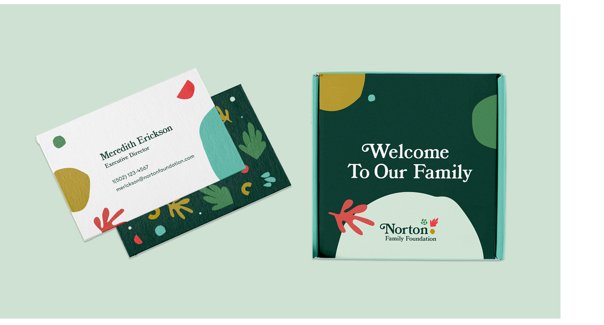
Applied the identity across print, digital, and web, bringing the brand to life through pattern, color, and flexible layouts. From stationery to website design, the system adapts easily while maintaining a strong, recognizable presence. The result is a cohesive brand experience that feels engaging, accessible, and deeply connected to the foundation’s mission and community.
Branding
Led the development of a playful, organic identity system inspired by nature, education, and hands-on learning. The brand mark, color palette, and supporting elements were designed to feel approachable and expressive—using simple shapes, natural tones, and child-like energy to create a sense of curiosity and growth. The system balances structure with spontaneity, allowing the brand to feel both grounded and full of life.