
Kyndly Benefits
Brand Identity
Live site
Overview
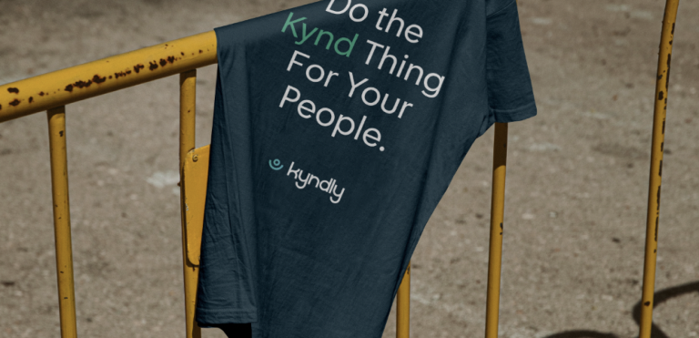
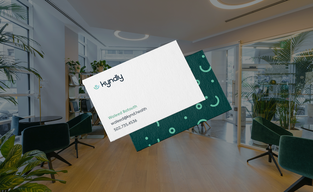
A full-scope rebrand for Kyndly Benefits spanning naming, identity, website design, and social media strategy. I led the development of the visual system, including the brand mark, color palette, and digital experience. The work focused on building a flexible, scalable brand that maintains clarity and consistency across platforms while making healthcare feel more accessible and intuitive.
CLIENT
Kyndly Benefits
Type
Brand Identity
year
2022 - 23
Branding
Led the rebrand of Kyndly Benefits, guiding naming, identity, and overall creative direction. Designed the brand mark and color system with a focus on creating a friendly, approachable, and accessible visual language. The identity was built to bring clarity and ease to the health insurance experience—helping users feel more comfortable navigating what is often a complex and overwhelming process.
Web Design
Designed and developed the Kyndly Benefits website as an extension of the brand system, translating the identity into a clear, user-friendly digital experience. Focused on intuitive layout, accessible design, and streamlined messaging to ensure users can easily understand and engage with the platform. The result is a cohesive web experience that reinforces the brand’s clarity and approachability.

